OFFF INTERNATIONAL FESTIVAL | 2010 OPEN TITLES | 2011
Beauty and strength are drawn to each other / OFFF Festival "2010 OPEN TITLES"
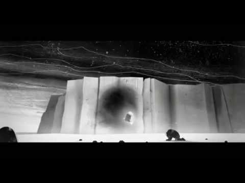
Fragments of living creatures mix together, and new species are born. In a strange space that's neither underwater nor airborne, mechanical elements and organic textures intertwine as the names of 45 speakers rise into view. It's an unforgettable piece of film that marked the debut of The Mill NY's design department.
The problem
OFFF is an international design festival built around the idea of "creative culture in the post-digital age," and in 2010 it was held in Paris. The Mill NY was asked to create that year's opening titles, and they took it on as the very first job for their newly formed integrated design and animation department. The brief from the client was surprisingly simple: "Make it cool. And include the names of 45 speakers." On a completely blank canvas, there was infinite freedom—and infinite pressure.
The insight
The core concept set out by design director Jeff Stevens was "the conflict between strength and beauty, and their affinity for one another." At the same time, he wanted to create something abstract that still "looked like nature." The idea of cutting and pasting biological elements together to create new species works perfectly as a metaphor for the design conference itself—a place where ideas collide and something new is born. The team obsessed over texture, and that commitment to fibers, outlines, and rough surfaces runs consistently through the characters, the environments, and even the typography itself. As Stevens put it, "Nothing had to be real. That was the best part."
The idea
The setting is an environment where underwater and airborne worlds seem to merge, populated by hybrid beings that are part living creature, part machine. Piles of cubes, mechanical parts attached to animals—all of it brings to life Stevens's longstanding belief that "machines are a product of nature." Based on illustrations by designer Kim Dulaney, the CG team built six completely distinct worlds. Each section required its own 3D development and compositing approach—there was no "economy of scale" and no reusing assets, as producer Boo Wong explained. The biggest challenge, Stevens recalled, was cutting ideas down. There simply weren't enough hands to realize every scene they truly wanted to make. Even so, each scene that remained carries an uncompromising density.
What happened
The title sequence premiered in June 2010 and became a major talking point in the design and motion graphics industry. The following year, in 2011, it won a Gold Lion at Cannes Lions. The industry outlet Motionographer praised it, saying "the leisurely journey through 45 names of titles showed off the immense potential of The Mill's new department." The project became a striking debut that hinted at just how much The Mill NY's design department would go on to accomplish.
Afterthought
I think the idea of cutting and pasting pieces of living creatures together to form new species perfectly captures the essence of a festival like OFFF—a place where different talents collide and something unexpected is born. Within the freedom of "not having to be real," the obsessive attention to texture and structure still holds up more than a decade later. Stevens's vision—that beauty and strength aren't opposites but are drawn to each other—seems to live in every corner of the frame. Seeing work like this makes me think a creative team's "debut piece" really is something special. That first all-out effort ends up shaping everything that comes after.
Awards
- Cannes Lions Gold 2011